
WHY IS COLOUR theory SO IMPORTANT IN PHOTOGRAPHY?
You have heard and read in lots of places that photography is light, in fact, the word photography derives from two words of Greek origin: photo (light) and graphy (writing) so we all agree that photography is the technique that allows us to write or capture light. And, if that is the case, why is it that sometimes we can have a photograph that is perfectly exposed and perfectly balanced in terms of lighting, but which does not end up being pleasing to the eye? Well, my friends, there is a very important part that comes into play here and that is, as you may have deduced, colour.
The world of colour is very extensive and there are a multitude of factors involved in it. In this article we will try to introduce you to this exciting world starting with the most basic concepts and to understand what we are doing when we carry out the famous colour correction of our photographs in an editing software..
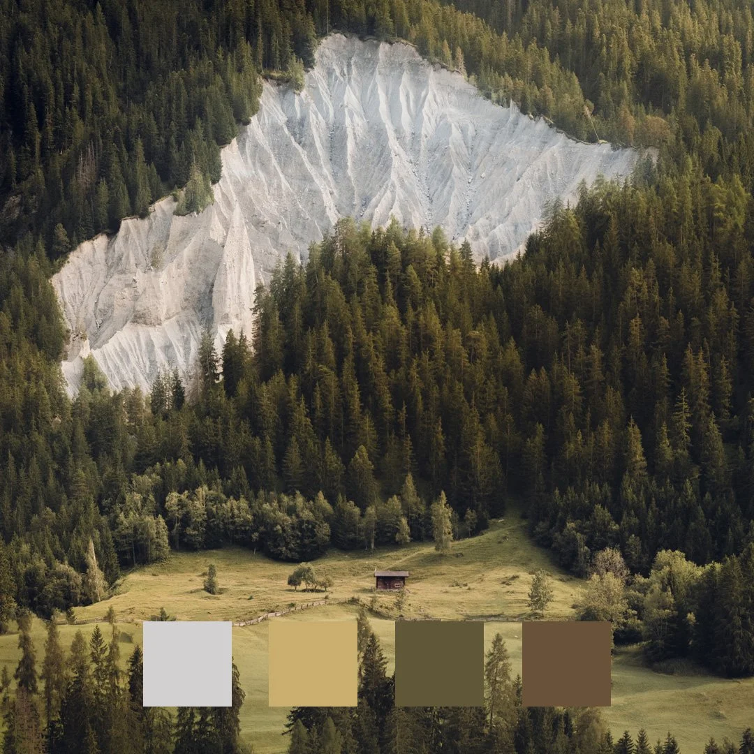
Colour palette of this image I took in the Swiss Alps.
If we get technical, colour is the impression produced in the retina of the eye by the rays of light (anda, light appears here!) reflected and absorbed by a body. Black is the colour that absorbs all the light and white is the colour we get as a result when all the light rays are reflected.
In technical jargon, each colour has a different wavelength and from this physical concept, which probably sounds like Chinese to you, it was possible to differentiate the three basic properties of a colour:
Hue or tone:
We usually use this concept in a colloquial way when we talk about colours. The tone or hue is simply the colour that we perceive in abundance. In other words, it is the difference between one colour and another. It is measured with the RGB scale (Red-Green-Blue) which indicates the ideal primary colours of light. Those that cannot be obtained by mixing any other colour. This scale allows us to differentiate the path that we find from one colour to another in a way that simplifies the world of colour to: red + its shades, green + its shades and blue + its shades.
Brightness or Luminosity:
Refers to the amount of light present in a colour in relation to black and white. Depending on the luminosity or brightness of a colour, we will obtain more or less dull colours. To give a practical example, if we add white to the primary colour red, we will obtain less intense and more illuminated shades of red, while if we add black we will obtain duller shades. To understand the importance of brightness and how it affects a photograph, a monochromatic photograph comes to mind right now, where the colour tone of all the elements is the same but we are still able to distinguish the silhouettes, the responsible for this is the brightness of each of the parts of the scene. If the light falls with greater intensity we will obtain brighter areas that will slightly modify the hue while the areas with shadows will be darker and will also slightly modify the hue.
Saturation:
When we talk about saturation we refer to the degree of purity, the vividness of the colour. This concept is what allows us to differentiate between very intense or paler colours (pastel colours). Just as brightness and luminosity are achieved by adding more or less light (black or white), saturation is achieved by mixing our primary colour with a grey of the same value. It is important not to confuse these two concepts. We can have a very luminous red but with less saturation just as we can have a red that is not very luminous but with a lot of saturation.
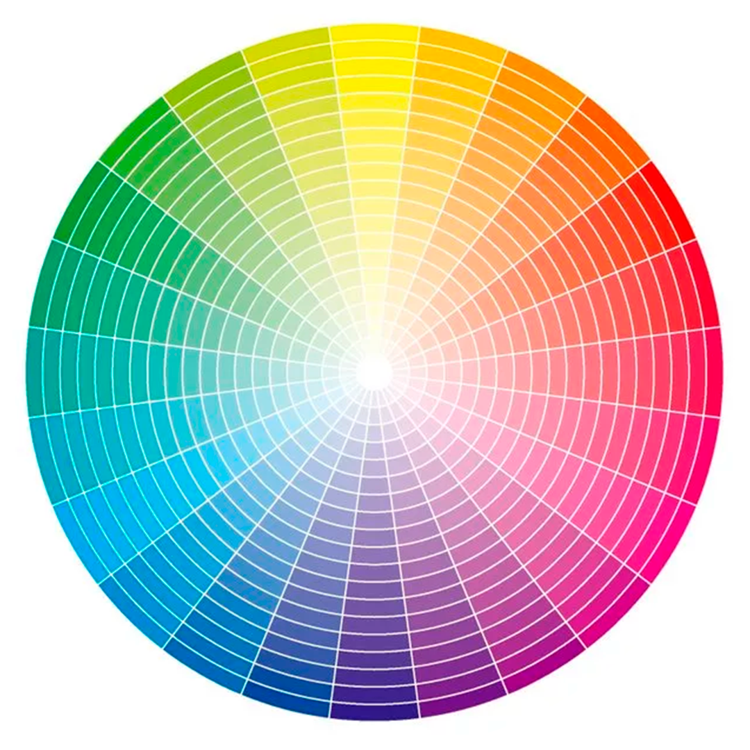
Isaac Newston, who was a gentleman as intelligent as he was kind, began to make the way a little easier for all later generations with his first sketches of the chromatic circle, after his experiments with prisms, and which has its basis in these three concepts that we have just explained.
Well, returning to the present century, the chromatic circle is to colour what the periodic table is to chemists, the recipe book is to any cookery enthusiast or the alphabet is to any language. Any basic answer to your doubts about colour can be found in the chromatic circle, so if we want to understand and use this language, we must know it fluently.
The basic chromatic circle is made up of the different tones that we can obtain from the primary colours:

Primary colours: Red, green, blue
Secondary colours: are obtained by mixing the primary colours with each other:
Red + green = Yellow
Red + blue = Magenta
Green + blue = Cyan
Tertiary colours: they are obtained by mixing the primary colours with the secondary ones.
Greenish yellow
Orange yellow
Orange red
Violet red
Violet blue
Greenish blue
In addition to this basic chromatic circle, we can find much more complete chromatic circles where the variations in brightness and saturation of the different shades are also shown, like the one I show you below:
And how can I use this to make these well-exposed but somewhat flawed photographs more harmonious and help me to convey my message better? By using colours and their mixtures in the right way. Just as the combination of black and white is something that never fails, there are other combinations that work perfectly with each other and will help you to achieve that "something" in terms of colour that your photographs lack. These relationships can be found in the chromatic circle and, using it as a cheat sheet, it is very easy to remember them:
Square colour scheme: we must draw a square on the chromatic circle and use the combination of the colours that are in the vertices of the square. This combination must be used with care as it sometimes fails.
Complementary:
Complementary colours are those on the opposite side of the colour wheel and are often used to create a strong contrast. For example: Blue and yellow.
Triadic:
By mentally drawing a triangle with equidistant vertices on the colour wheel. The three colours that remain at the vertices of the triangle will be the ones that will work in our combination.
Analogues:
This is a combination that I love because of the harmony and tranquillity that it transmits. It consists of using the colours that are on either side of the one we choose as a starting point.
Tetradic:
Using two complementary colours. It will provide us with strong contrasts in the image, although we must use it intelligently, as the correct compensation of the quantity of each of the colours in the image will be what makes it work correctly.
If this is your first contact with the chromatic circle, don't panic, I assure you that its use is much simpler than its explanation. Now that you have the basic concepts clear, the important thing is to put them into practice: create your own colour combinations in controlled situations such as still lifes or even play with modifying the colours of a photograph you have on your hard drive with the colour substitution tool in Photoshop. The important thing is trial and error so that you can see with your own eyes and playing with colours the effects they produce in an image, become familiar with new combinations and finally choose your favourites to look for those colour palettes in nature.
See you colouring!
AUTHOR:

MARA DE LA TORRE
Professional travel & commercial photographer. Content creator spesialised in storytelling.
Lover of nature and capturing it through the lenses
FOLLOW ME ON SOCIAL MEDIA
YOU MAY ALSO BE INTERESTED IN....


